Balloon Ampersand

By Conor and David.
A really great ampersand poster. Watching the making-of video is especially interesting.
By Conor and David.
A really great ampersand poster. Watching the making-of video is especially interesting.


The last presidential campaign to use an ampersand in their logo/political sign was around for a good eight years. Coincidence?
USA Political Election Logos 2000-1960
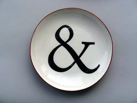
by cul-de-sac found on design sponge.
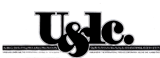
Here is the classic U&lc logo by Herb Lubalin. I don’t have much to day about it so I think I will let Steven Heller say it. Herb Lubalin: Rule Basher.
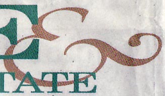
This beast came from the Berkeley Daily Planet in the Home & Real Estate section.
And one more. Pretty ordinary except for the mysterious bump on the middle stroke.
With ampersands of course.
The first two are from the amazing old-school butcher shop called Little City.
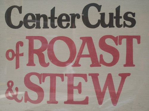
Roast & Stew
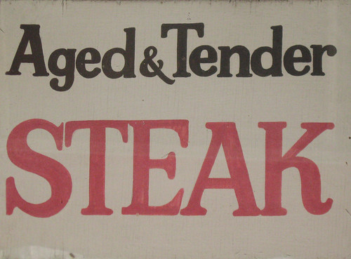
Aged & Tender
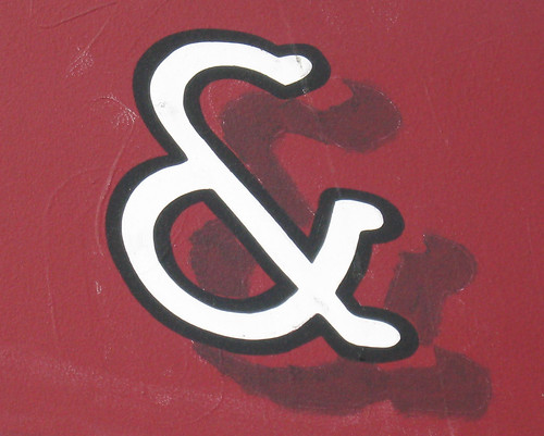
Another one from down the street. I like the drop shadow. (by Arrón Quiñones)
Quoted from page 78 of Elements of Typographic Style (version 2.5) by Robert Bringhurst.
5.1.3 In heads and titles, use the best available ampersand.
The ampersand is a symbol evolved from the Latin et, meaning and. It is one of the oldest alphabetic abbreviations, and it has assumed over the centuries a wonderful variety of forms. Contemporary offerings are for the most part uninspired, stolid pretzels: unmusical imitations of the treble clef. Often the italic font with an ampersand less repressed than it’s roman counterpart. Since the ampersand is more often used in display work than in ordinary text, the more creative versions are more useful. There is rarely any reason not to borrow the italic ampersand for use with roman text.
From the sidebar on the same page:
Earlier typographers made liberal use of ampersands, especially when setting italic — and relished in their variety of form. The 16th century French printer Christophe Plantin sometimes uses four quite different ampersands in the course of a single paragraph, even when setting something as unwhimsical as the eight-volume polylingual Bible on which he devoted more than six years of his life.
See also: The Elements of Typographic Style Applied to the Web.
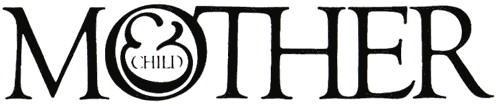
An excellent use of an ampersand in a logo. Herb was a master.
Scanned from A History of Graphic Design, by Meggs.
Learn More about Herb Lubalin here.
Here are a couple I spotted on my way home today:
There were hand painted Ampersands

A local deli. I really like this one. Hand-painted and chubby.
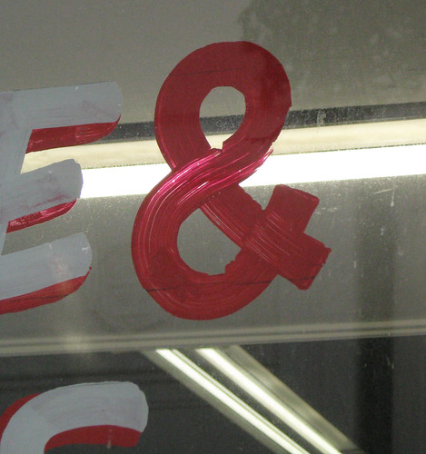
Coffee & Donuts. Another old-school hand-painted sign.
Some clean sans-serif ones
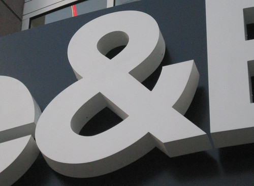
The old classic Helvetica ampersand from the Crate & Barrel logo. Helvetica always looks great giant and 3-D like that.
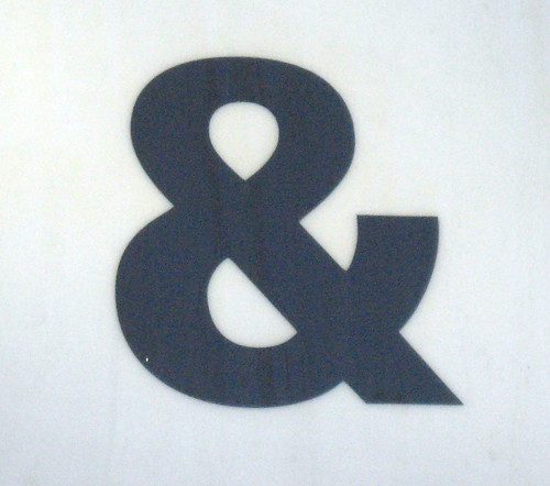
Your standard sans-serif ampersand. From a deli/liquor store awning.
A curly one

Probably a law firm.
Some odd ones
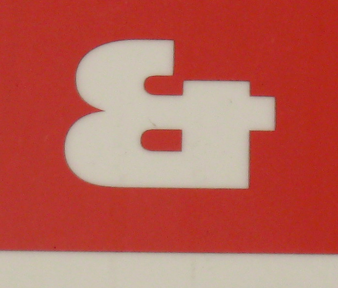
nice and square. “Et” style ampersand, appears to be based on a “B.”
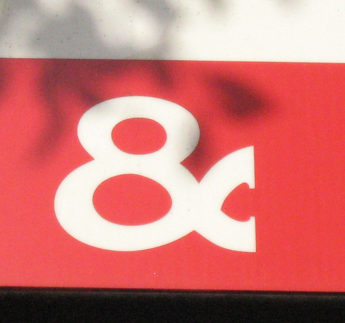
This one is absolutely horrible. Notice the “8” shape.